Project Overview
CyberInk is a university project for an Information Systems course called ‘Mobile Applications Development’. The application aims to equips university students from all disciplines with the fundamental knowledge of common cyber security threats and methods to increase their digital and cyber resilience.
UI/UX Designer
Mobile App
March-21 - May-21
Team & Role
I was the UI/UX Designer in Project CyberInk, responsible for taking user requirements and developing various wireframes and prototypes on Adobe XD and Android Studio. The team also consisted of a Developer, Business Analyst and Project Manager.
The Design Process
Our team followed a Design Thinking approach, aiming to incorporate the stages ‘Empathise’, ‘Define’, ‘Ideate’, ‘Prototype’ and ‘Test’ in our project. We spent most of the project in the ‘Empathise’ stage as we really wanted to understand the challenges students faced when it came to protecting their digital assets.

Research: User Surveys
Surveys were a non-invasive way for the team to assess the general cyber security knowledge and behaviour of the everyday university student, which helped the team define the key issues in our problem domain.
I collaborated closely with the Business Analysts to design user surveys. A total of 30 university students were surveyed, from a variety of years and degrees.
The key findings were as follows:
- 70% of students had fallen victim to a scam in the past
- 65% of students change their password infrequently (once every 6 months)
- 70% of students used the same password for multiple accounts
- 80% of students could not identify more than 2 cyber threats
- 80% of students were interested in learning more about common cyber security threats

Empathise: Empathy Map
Based on the information derived from the surveys we conducted and our initial research, I aimed to summarise our target user’s key behaviours and frustrations by creating an empathy map.
This allowed the team to understand the user’s pain points so we could define the core problem our solution was aiming to address.
After reviewing the empathy map together as a team, we defined the key user pain points:
High technical barrier to understanding cyber security
Overwhelming amount of information to protect online
Lack of transparency regarding what information to trust online

Define
After gathering findings from research, I worked closely with the team to define the problem statement.
Problem Statement:
University students are overwhelmed with the amount of information they need to protect online, which coupled with the technical nature of cyber security, has caused them to neglect the importance of remaining vigilant in the digital world.
I framed this problem as an opportunity by developing a ‘How Might We’ (HMW) statement to enable the team to begin ideating.
How Might We Statement:
How might we empower university students to protect their most important digital assets and increase their cyber resilience in a fun and engaging way?
Ideation: Defining the MVP
After brainstorming and ideating solutions based on the statements developed earlier, our team landed on a gamified cyber security experience, which allowed the application to address the user’s primary need of learning cyber security awareness in a fun, simple and engaging way.
As the Designer, I took the teams’ idea and developed a preliminary product concept with five core functionalities:
- Mini games: allows a user to play cyber security games to increase their awareness of cyber security threats and best practices to protect their digital assets.
- Quizzes: quizzes allow students to test the theory they learn from learning modules in a simple and engaging way, which minimises their cognitive load.
- Notes: users can take digital notes when progressing through content, which will allow them to engage with the theory in a meaningful way, enhancing the learning process.
- Cyber Security News Feed: this feature allows the users to stay up to date with the world of technology and presents them with real life examples of topics they have learnt in the application. This further the user’s educational experience, giving them an incentive to continue to learn and care about cyber security.
- Experience Points & Trophies: users have a defence level in the application, which they can increase by earning experience points from completing modules. Completing modules and mini games also enables the user to unlock trophies
I worked with the Developer to create a use-case diagram that mapped out the technical system requirements of our MVP.

Prototyping & Testing
Sketching
To approach the design of the application, I started by sketching out our concept on paper. The aim of this prototype was to determine the main pages, basic layout of those pages.
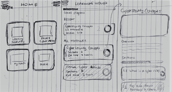
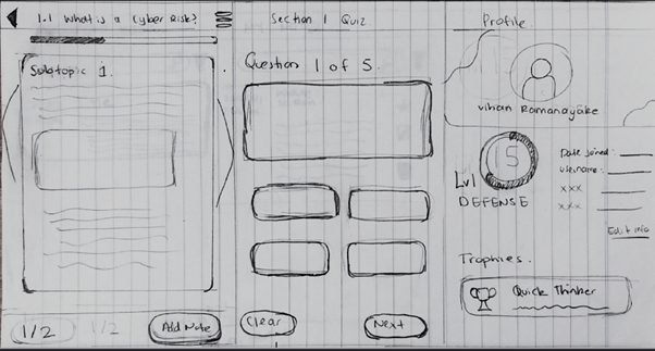
Wireframing
A low fidelity prototype was developed utilising Adobe XD. The aim of this prototype was to determine the colours and theme of the application. A low- fidelity prototype allowed the team to easily communicate our ideas to potential end users without the extensive use of resources. The preliminary design concept of CyberInk is showcased above.
Feedback: feedback in relation to CyberInk’s concept and design was gathered from its target users, university students. The general sentiment of users was positive, with many expressing that the simple card layout was intuitive and predictable. There were common suggestions by the majority of surveyees to enhance the user experience with a navigation bar that allowed the user to seamlessly move between the pages depicted in the home screen. Many students also expressed that the purple background of the application was too ‘flashy’. The team’s intention to create a techy theme unknowingly made it difficult for users to concentrate on the content of the application, which was an important consideration in future iterations.

Final Design
Upon gathering initial user feedback and validating the applications’ design, I developed a final high-fidelity prototype in Adobe XD, which allowed the team to acquire a better understanding of the user journey and logic of the application.
By integrating suggested improvements, in addition to design best practices documented in Nielson’s Ten Usability Heuristics, I produced a user interphase that was intuitive and a user-friendly experience.
Below are the final high-fidelity wireframes that were created in Figma, visually outlining each step of the user’s journey.


